


BookTok Made Me Do It
The Secret to a Stunning AND Easy-to-Follow romantasy

This is a two-part deep dive on making your book not just beautiful, but beautifully clear.
📖 This week: Why book aesthetics matter more than ever, and how multiple POVs can help.🗺️ Next week: We map it all out. Literally. Because no fantasy or romantasy is complete without one.
❤️ this post if you’re a sucker for pretty books that actually make sense.
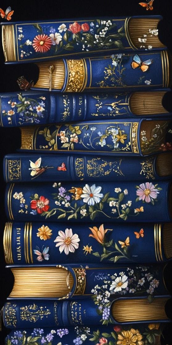
If you’ve scrolled through BookTok or Bookstagram lately, you’ve probably noticed that books aren’t just judged by their stories, they’re also adored as aesthetic objects. Special edition hardcovers with sprayed color edges, foil-stamped covers, decorative endpapers, and exclusive art are huge right now. Just type “#Spredges” (sprayed edges).
Why now?
A big reason is that social media is an inherently visual medium. On TikTok, for example, showing off a gorgeous physical book makes for a far more eye-catching video than displaying an e-reader screen.
80% of young Gen Z readers (ages 14–25 in Britain) prefer print over digital—a trend partly attributed to BookTokers. A pretty book isn’t just for reading; it’s a statement piece, a photo prop, and a collectible. Enthusiasts on Instagram post “shelfies” (shelf photos) arranged by color or proudly display sprayed-edge special editions. On TikTok, you’ll see hands tracing gilded illustrations or revealing hidden cover art under a dust jacket. This visual book porn (like food porn) creates FOMO among readers—if everyone online is raving about a limited edition with stenciled edges, you suddenly need that edition too.
Beyond boosting sales, this focus on aesthetics has created a culture of collectors. It’s not unusual now for superfans to buy multiple editions of the same novel—one to read, and one (or more) to display. Limited prints with foil illustrations or thematic chapter header art become coveted items. And when readers post their unboxings on TikTok and Instagram, the cycle continues: more people see the gorgeous editions and are tempted to buy them.
A visually striking book is more likely to be featured in a TikTok video or go viral on Instagram. It’s free marketing.
I already delved into the importance of book covers in the past. This week and next, I’ll talk about two ways I (and you can too) made my book not only more visually beautiful but also easier to follow.
POV Chapter Art
I chose to write my book with multiple POVs—I have six in total. Multi-POV chapter headers let readers see the story’s world from various angles, offering a richer, more layered understanding of events, relationships, and settings.
Alternating POVs allows authors to control pacing, create suspense, and strategically place cliffhangers—leaving one character in peril and switching to another, thus compelling readers to keep turning the pages.
And this, some of my beta readers found a bit confusing. So one of the strategies I came up with was to design a different head chapter for each POV.
💬 How do you feel about multiple POVs in fantasy? Love them? Hate them? Survive them?
I’ve seen this done beautifully in Gild by Raven Kennedy, which I reviewed in last week’s post.

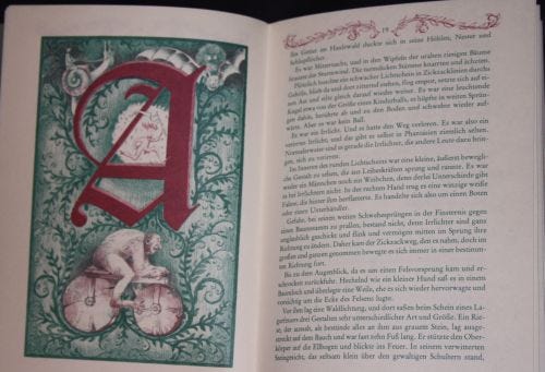
But this idea isn’t entirely new. Classic fantasy books played with unique chapter art and formatting too. Michael Ende’s The Neverending Story (1979) famously printed its text in two colors (red and green) to distinguish between the real-world storyline and the fantasy world of Fantasia. Each chapter even begins with an ornate illustrated capital letter, drawn in both red and green, to show how the two worlds intertwine. It’s a beautiful design choice that also serves the story, signaling to the reader which “world” they’re in at any moment.
By starting each chapter with the POV character’s name and a unique identifier, readers are immediately oriented to whose perspective they are following, which is especially crucial in stories with several POVs. This clarity prevents disorientation, ensuring readers can easily track narrative shifts and stay engaged with the unfolding story. This approach is especially effective for conveying large-scale events or deep emotional dynamics.
So this is what I did:
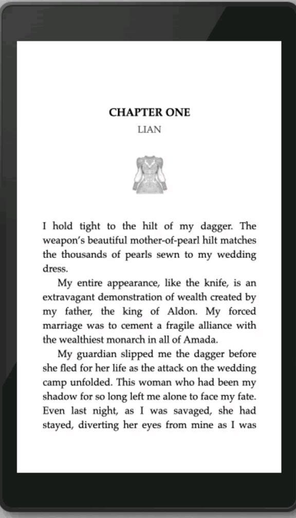
Lian is the main POV in Humans Don’t Have Horns, but the story unfolds through six different perspectives.
To help readers stay grounded, I designed a unique chapter header for each POV—because clarity can be beautiful.


Lovely post! I have say I became an avid reader because of Booktok and I also fall into that 14-25 age group category. I think it’s really important for young (adult) readers to not blindly follow these trends and form their own judgement. I did influence by Booktok and thought ‘I need to buy these books although I’ve already read them?’ Or ‘To show that I love this book, I have to have them in physical copy, e-book and audiobook version’.
I never act on it but I think it’s crucial that readers know that love reading isn’t about how many book trophies you have, how many annotations in a book and how many copies you have. It’s about how it affects your life and the way you think.
I do not fall into the age gap (14-25) maybe that's the reason I don't run to collect Special Editions with spredges. But I do love a multi pov and the idea to help the readers navigate through it with art. It's just lovely.
I can't wait to read your book.